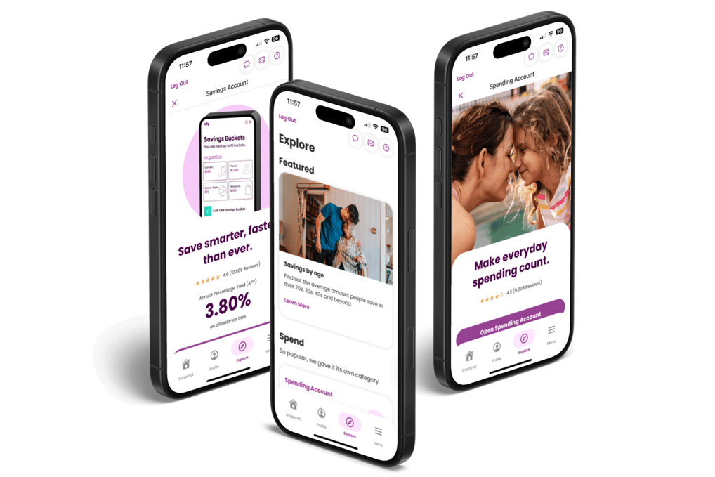
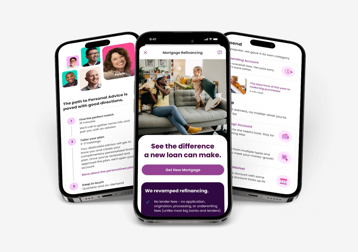
Ally App: Product Exploration, Reimagined.
Overview
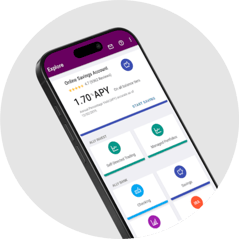
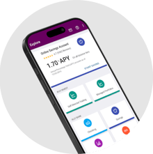
Banking apps should make it easy to discover and understand financial products—but Ally’s mobile experience wasn’t quite there yet. I led the redesign of the Explore feature to make product discovery simpler, smarter, and more user-friendly.
The Challenge
Users had to click through too many screens to find products, and the content lacked personalization or clarity. The result? Friction for users and missed engagement opportunities for the business.
Goals
"How might we design the explore tab feature in the bank mobile app to provide personalized recommendations tailored to each user's financial goals and preferences?"
Improve usability and satisfaction
Track user behavior through analytics to drive continuous improvements

Simplify product discovery and comparison


Personalize the experience with featured products and curated content
As Lead UX Designer, I drove the end-to-end design of the new Explore experience, from strategy to pixel-perfect execution. My responsibilities included:
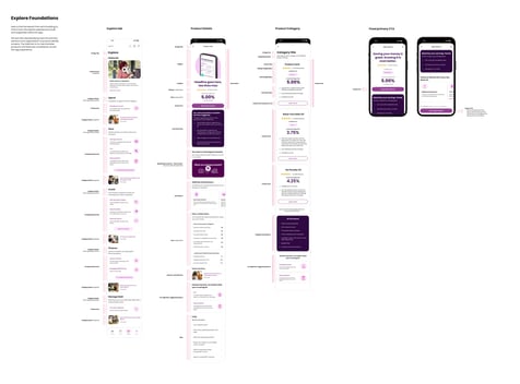
Redesigned the Explore flow and home page
Created templates and custom icons aligned with Ally’s brand
Reorganized content architecture for clarity
Partnered with content strategists to make copy mobile-friendly
Designed a bottom sheet for deeper product details
My Role
Figma • FigJam • Adobe Photoshop • Adobe Illustrator • UserTesting
Project Time: 6 Months
Tap the image to enlarge
The Process
Research & Discovery
We started with user research to understand the friction points. Interviews, feedback reviews, and analytics revealed one core insight: users weren’t just browsing—they were trying to make informed decisions. But the app wasn’t meeting them halfway.
IA & Wireframes
I collaborated with stakeholders to restructure the way products were categorized and surfaced. Then, I translated those decisions into low-fidelity wireframes and clickable prototypes for early feedback.
Pattern Discovery
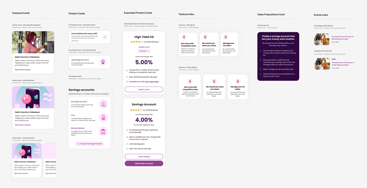
As part of the redesign, we explored scalable merchandising and discovery patterns that could live anywhere across the mobile app experience—from home to product pages. The goal was to create flexible UI components that drive engagement and support the attract/sell journey.
These patterns were designed to be modular, mobile-first, and easy to mix and match depending on context—supporting both personalization and product storytelling across the app.
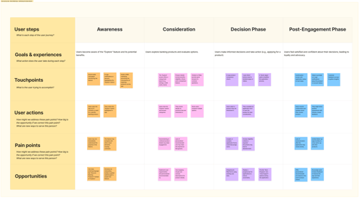
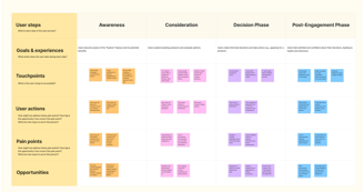
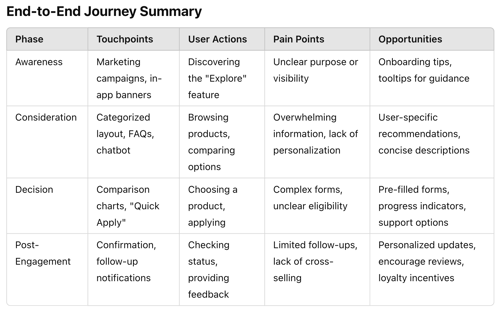
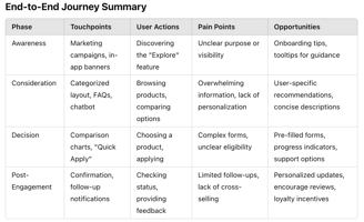
I mapped out a customer journey focused specifically on product exploration, identifying emotional and functional gaps across the experience.
A previous version of the Ally App
Click to open full screen preview
Defining Success
Increasing product page CTRs
Improving satisfaction scores in usability testing
Enabling better cross-sell opportunities through smarter content
I translated those insights into measurable goals that directly addressed both user needs and business priorities.
Icon Design & Discovery
To bring more clarity and personality to the Explore experience, I helped create a custom set of icons for key products and features.
I followed Ally’s style guide to keep everything on-brand, and where existing icons fell short, I designed new ones to ensure consistency and clarity. These icons now live across product cards and featured content—making the experience more scannable, approachable, and intuitive.
Visual Storytelling Through Photos
When we pick images, we’re not just filling space—we're telling a story. Every photo should feel human, honest, and in sync with our brand. These guidelines help us stay visually consistent and emotionally connected to our audience.
Visual Design
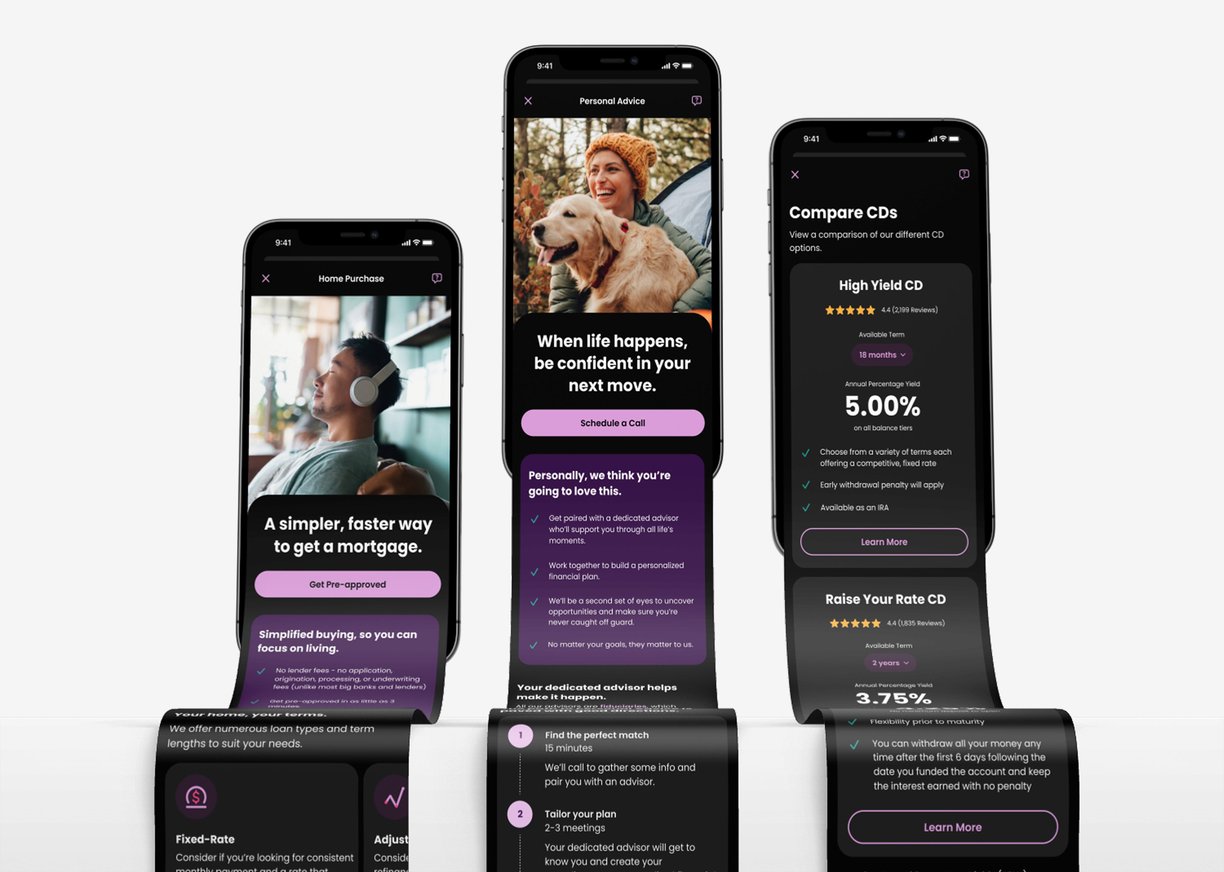
Once the structure was in place, I brought the UI to life with clean, intuitive layouts that reflected Ally’s friendly, modern vibe. The goal was to strike the right balance between personality and clarity—while ensuring a seamless experience in both light and dark mode.
DO: Authentic Human Emotions
Show Real Human Emotions: Pick photos where people are genuinely smiling, thinking, exploring—anything that feels real. We want joy, curiosity, and determination to come through naturally.
Keep It Natural
Look for everyday moments—someone talking with a friend, working on something they love, or just enjoying their surroundings. The more natural and unforced, the better.Choose Relatable Scenes
Aim for warm, friendly settings that feel familiar. Think cozy cafes, bright homes, lively markets—places where people actually live and connect. Keep it grounded and real.
DON'T: Staged or Inauthentic Imagery
No Posed or Stiff Photos
If it looks like a stock photo or feels fake, pass on it. People standing awkwardly in suits or staring blankly at a screen? Not our vibe.No Cliché Office Shots
Let’s skip the generic boardrooms and high-fives in suits. We’re aiming for authenticity, not a "corporate brochure."No Forced Emotions
Big cheesy grins or dramatic expressions? Nope. If it doesn’t feel genuine, don’t use it.








By focusing on authentic, positive imagery, you can create a visual experience that genuinely connects with your users and enhances their engagement with your product.
dark mode
light mode
Content Strategy
Worked with the content team to tailor product pages for mobile, rewriting copy to be clear, engaging, and user-friendly on smaller screens.
Usability Testing
I ran usability tests to see how the designs held up in real hands. The feedback was positive. I used it to fine-tune the experience and ensure the final product worked for people, not just on paper.
Accessibility
I made sure the experience was inclusive and easy for everyone by following accessibility best practices, such as strong color contrast, clean typography, and touch-friendly targets. It’s all about making sure nobody gets left out.
Challenges and Solutions
Challenge 1: Overcrowded Home Page Design
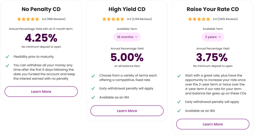
Problem: The Explore home page was cluttered, particularly the CDs section, which overwhelmed users with too many products and excessive information.
Solution:
Simplified the CDs section by providing a single concise description for all CDs.
Introduced a dedicated comparison page that users can access by clicking on a CD card. This page highlights key features of each CD side by side, enabling users to make informed decisions easily.
Challenge 2: Clashing Information on Product Pages
Problem: Product pages included multiple sections for key value propositions, special features, and key features, leading to redundancy and an overabundance of bullet points, which negatively impacted readability and usability.
Solution:
Redesigned the layout by introducing a carousel-style interface for the key features section. This allowed users to swipe or scroll horizontally to view information, making the design cleaner, more user-friendly, and easier to consume.
Challenge 3: Clashing Information on Product Pages
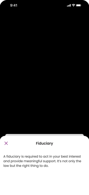
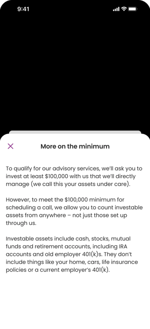
Problem: When users came across complex terms or fee explanations, they needed clarity—but navigating away from the screen for help felt disruptive.
Solution:
We introduced a fly-out contextual help drawer that offers quick, inline explanations without leaving the page. It keeps the user focused, informed, and in control of their experience.
Results and Impact
Engagement Up
Users spent more time exploring personalized content
Conversions Up
More users followed through with product exploration
Usability Improved
Users navigated the app more confidently and with fewer errors
Accessibility Better
The new design met AA standards and improved screen reader performance
Looking Back
This project reinforced the value of user-centered design and cross-functional collaboration. Research revealed users needed clearer, more intuitive product exploration, which directly informed our approach.
Close alignment with stakeholders ensured we delivered on both user needs and business goals, while analytics helped us validate decisions and identify future improvement opportunities.
It was a strong example of how empathy, strategy, and iteration can lead to impactful results.

